Help Article
Report Designer

Who can use this feature?
By default, users with Admin role permissions
Purpose
Report Designer allows you to create and design reports for custom-configured Activity and Lab Test Forms. After creating a Report Type, you can start designing your report to meet your firms exact requirements.
Accessing Report Designer
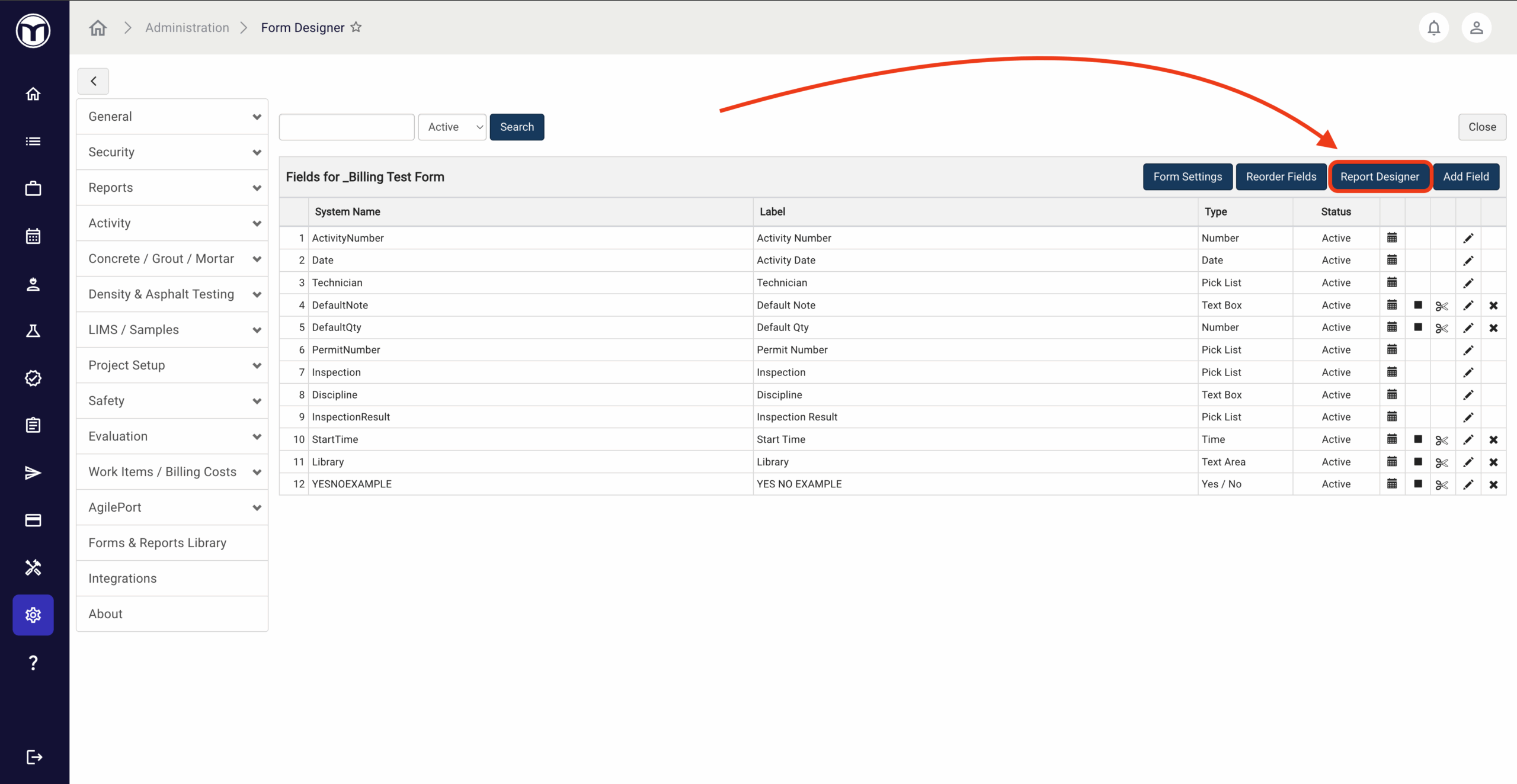
To open Report Designer, enter the Admin module then navigate to the page containing the relevant form type, such as:
- Activity → Forms
- LIMS / Samples → Sample Forms
- LIMS / Samples → Test Forms
From these pages, click the hyperlinked name of the form to open it in Form Designer—then press the Report Designer button. If the selected form is not used in any report yet, you'll be prompted to Add New Report.

Working With Report Designer
When you first open the Report Designer, you will see a blank "page" and various menu options above and on the right. Use the buttons above to Save, Undo, Redo, and select a display mode for your report (Portrait vs. Landscape).

To the right of the report, you can access various tabs to customize its layout, featured elements, and settings. Here's a quick rundown of each tab:
Elements
Every report template contains various elements. These elements define the layout and describe how the form's data should be rendered in the report. To add an element, click and drag it into the report.

Learn More
| Element | Description |
| Label | Allows you to add a label on the report. |
| Paragraph | Used only for labels. Allows you to string labels together. |
| Panel | Allows you to group fields or other elements within a Panel on the report Helpful when formatting data in columns |
| Vertical Table | Applies a table where the headers run along the left column Can be used to display fields from a single data grid OR fields from the main / section level |
| Horizontal Table | Applies a table where the headers run across the top Can be used to display fields from a single data grid OR fields from the main / section level |
| Checkbox List | Use for Picklist, Multiple Choice and Yes/No fields only Displays all options on the report, with the selected items checked |
| Image | Allows you to designate a place on the report for images to display that were previously uploaded to the associated form. You can also add an uploaded image by working with Datasets. NOTE: if you wish to upload a static image to the report please see the Report Resources section. |
| Line | Allows you to place a line on the report |
| Page Break | Allows you to place a page break on the report in the location you drop the element |
| Multi Record Grid | Allows you to place a multi-record grid within the report |
| Footnote | Adds a footnote section to the report |
| Aggregate Function | Adds a multi-record aggregate function |
Datasets
Data Sources are used to specify dynamic data for the elements on your report. This area is split into four sections:


- Add Existing Form to Report
Allows you to add additional forms to your report. To remove a form, you must delete all of the associated fields displaying on the report first. Once this is done, expand the form data set and choose the Delete Form button. - Form Field Sets
List of all the Fields available on a Form. Click and drag your field to add it to the report. - Report Metadata
List of Project level data, Lab values (Lab Reports only) and various report attributes. Click and drag an item to add it to the report. - Report Resources
You can add or remove images that will display on every report. After an image is added as a resource, it also must be placed on the report.
When working with a Form dataset, you can sort the fields Alphabetically or by the Order in which they display on the report, as well as view Active Fields, Inactive Fields or All Fields.
Properties
Used to control formatting of individual items on the report. Depending on the Report Element you are working with, different items will display under the Properties tab.
Learn More
| Property | Description |
| Width | Sets the width of an element in a panel. Enter a percentage of the panel or pixel value. It is important to understand how the Width option works for different elements. The Width can be left empty or can be set in different units: "%" or "px". When working with elements to define the layout of the template it is recommended to use %. When the Width option is empty, the system will use the default value for the element: - Labels: Auto or as wide as the text inside - Panels and Tables: 100% (Full width) |
| Minimum / Maximum Height | Allows control of the set height for various elements. |
| Border | Allows you to display a border for a panel. Enter a pixel value. |
| Group By | Used to "flatten" the Sample Tracking data structure on reports - not applicable to Activity reports. When creating Sample Tracking / Test reports, it is recommended to create three separate panels to report the three different "levels" of the Sample Tracking data structure. - Sample - Specimen - Test Apply the Group By property to each of the three panels and select the name of your respective sample, specimen and test forms in the Group By list. After creating the three primary panels, place additional panels and fields within each of these three primary panels. |
| Text | Allows you to set the text that displays for a label. |
| Data Set | Allows you to set the Data Set for a field. |
| Source | Must choose a Data Set first. You can pick a field that will dynamically populate upon report generation. |
| Font Size | Control the font size. |
| Bold | Two choices: False = Font will not be bolded True = Font will be bolded |
| Italic | Two choices: False = Font will not be italicized True = Font will be italicized |
| Underline | Two choices: False = Font will not be underlined True = Font will be underlined |
| Text Align | Formats the justification for the contents in a label or field. Options are Left, Center or Right. |
| Hide Expression | Allows you to hide an element based on empty values of other fields. |
| Direction | Allows you to align the elements inside a panel. |
| Padding | Controls amount of white space that will appear between elements. |
| Number Format | Used for Number field types only. Allows you to control certain aspects of how a number will be expressed on the report. Examples: Decimal places, leading zeros, percentage, thousands separators. |
| Background Color | Use to apply a background color to a panel or table. |
| Options to Display | Used for Picklist, Multiple Choice and Yes/No fields only when added to the report as a checkbox display. Controls if all options display as checkboxes or only the selected options. |
| Options Orientation | Used for Picklist, Multiple Choice and Yes/No fields only when added to the report as a checkbox display. Controls if the options display vertically or horizontally. |
Report Settings
Allows you to define the settings for each report (report name, titles, legal text, digital signature properties, etc.). Depending on the type of report you are working with (Activity or Lab Test), you will see different options.
Learn More
| Setting | Description |
| Report Name | Name for the report design. Not to be confused with the Report Title (below). |
| Report Code | Short name / code for the report. Must be unique across the system. |
| Default Title | Default title of the report. |
| Alternate Field Title | Tile of the report that will override the Default Title if the report is generated from the Field module. |
| Alternate QC Title | Tile of the report that will override the Default Title if the report is generated from the QC module. |
| Allow Alternate Report Title At Run Time | Gives the user generating a report the option to override the Report Title. |
| Standard | Discloses an operational standard that the report meets / is for (i.e. ASTM 1234). |
| Digital Signature Configuration | Assigns the digital signature profile / option that is available for this report. |
| Send Field Reports To | Allows generated Field Reports to be sent to Review (QC) for report review or, straight to Delivery. |
| Display File Uploads | Allows for configuration for all file uploads to display or, just uploads on the report template. |
| Repeat Table Headers | If a table extends to a subsequent page, column headers can be set to display again, at the top of the subsequent pages. |
| Field Legal Text | Legal text appearing at the bottom of the report if generated from the Field module. |
| QC Legal Text | Legal text appearing at the bottom of the report if generated from the Review (QC) module. |
| Allow Field Signature Capture On Field Reports | Determines if a field signature can be captured when generating the report from the Field module. A field signature is similar to signing for a courier delivery - report recipient would "sign off" on the screen that the report has been delivered. The signature obtained is part of the Field report generated. |
| Report Image | Allows for uploading of static image onto report. |
| Report Text | Allows for static text to display at bottom of report's body. |
| Show Report Date In Header | Displays the data of which the report was finalized and created in the header (not necessarily the same date as the activity / data). |
| Show Report Time In Header | Displays the time of when the report was finalized and created in the header (not the time that the activity/data was entered). Show Report Date in Header setting must be selected to see this option. |
| File Name | Format of the file name generated for the report. Placeholder variables can be used to configure the file name. See table in the next section below for more details about placeholder options. |
| Description | Format of the report description metadata generated for the report. Placeholder variables can be used to configure the report description, including {{SetNumber}} to return the sample's set number. |
| Include Description For Associated Reports | If associated report(s) exists, a short description of the will appear near the end of the body of the report (similar to a table of contents). |
| Apply Page Break On Every New Record | Inserts an automatic page break when multiple form records are included in one report. The start of each form included on the report will appear at the top of a a page. For reports using Multi-record/Grouped record grid elements, this setting should not be used. |
| Show In Report Associations | Allows for report type to be in available list of reports that can be associated to other reports. |
| Show In QC Draft Report Filter | Allows for report type to be added as an option in Report Type filter (picklist) in Review (QC) Draft Report module. |
| Show In Delivery Report Filter | Allows for report type to be added as an option in Report Type filter (picklist) in Delivery module. |
| Allow Emailing On Finalize | Allows for the person finalizing a report to also email the report as part of the finalization process. |
| Allow Publishing On Finalize | Allows for the person finalizing a report to also make the report public in AgilePort. |
| Allow Override Digital Signature Configuration On Projects | Allows for user to apply a different digital signature type, based on project specification setting. (I.e., Typically sign this report but, for specific project, need to apply a seal instead.) |
| Internal Report | - Yes = Report is used primarily for internal operations - No = Report is used primarily for distribution to clients / customers |
| Test List Report | - Yes = Only reports marked with "YES" can be viewed when clicking on the Print early Test List - No = Only reports marked with "NO" are listed in "Preview Report" |
| Type | Form type the report is for. System value that is not editable. |
| Header And Footer Type | - System = Standard MetaField report header / footer assigned - Custom = Report designer is able to design their own header / footer using the Report Designer - None = No header / footer is included on the report |
| Allow Distinct Header And Footer On Each Record | Displays if Header And Footer Type = Custom AND Apply Page Break On Every New Record = Yes Displays if Allow Distinct Header And Footer On Each Record = Yes This setting will force a distinct header value for each underlying form instead of combining / concatenating / taking the first value when there are multiple values to report. |
| Custom Paging Placeholder | Displays if Header And Footer Type = Custom. |
| Include WBS / Cost Summary | No (default) = WBS and Cost summary is not included in report Yes = WBS and/ or Cost summary is included in report |
| Add WBS Fields | This is only available if Include WBS / Cost Summary is toggled to Yes - Yes = WBS fields are included in the summary report. - No = Only Cost summary is included and the WBS fields are not summarized on the report. |
| Number Of Elements | Count of the number of elements in your report design (label, field value, line, panel, etc. are all examples of elements). Report designs are limited to 500 elements. |
Placeholders
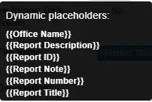
Both the File Name and Report Description values have dynamic placeholder values that can be implemented. Hover over the information icon next to each field to see the available placeholders. The placeholders are case sensitive and must be placed within brackets {{ }}.
File Name
Dictates the name of the file if a report is downloaded or emailed. Customizing this value can make it easy for clients to better identify a report without having to open the file PDF file:
| Placeholder | Description |
| Office Name | Inserts the office value that is selected when generating a report. |
| Report Description | Inserts the 'Report Description' which is can also be configured within the Report Designer. |
| Report ID | A number that serves as a unique identifier for a report. No two reports will have the same ID. |
| Report Note | Inserts the text value entered in the 'Report Note' field which a user can enter before finalizing a report. |
| Report Number | If report numbering is turned on, then the file name will include the report number. |
| Report Title | Inserts the 'Default Title' value set within the report designer. |
Report Description

| Placeholder | Description |
| ActivityNumber | For Activity records only, displays the date the activity number identifier found in most activity forms. |
| ActivityDate | For Activity records only, displays the date the activity date found in most activity forms. |
| ClientName | The name of the client associated with the project. |
| ClientProjectNumber | The 'External ID' set on the project setup page. |
| CurrentUser | Display the name of the user generating the report. |
| DensityTestDate | For Density tests only, displays the date the test was conducted. |
| DensityTestNumber | For Density tests only, displays the test number associated with the density test record. |
| FieldActivityDate | For Activity records only, displays the date the Field Activity Date found in some activity forms. |
| LabTestDate | For Test records processed through the Lab (LIMS) module. Displays the date the test was conducted. |
| LabTestNumber | For Test records processed through the Lab (LIMS) module. Displays the date test number for the test record. |
| LargestTestAge | For Test records processed through the Lab (LIMS) module. Displays the largest number found in a specimen set. |
| Location | For Test records processed through the Lab (LIMS) module. Displays the data entered in 'Location' field. |
| LocationDetails | For Test records processed through the Lab (LIMS) module. Displays the data entered in 'Location Details' field. |
| ProjectName | Displays the current Project Name. |
| ProjectNumber | Displays the current Project Number. |
| ReportDate | Displays the date the report was generated. |
| SampleDate | Displays the data a sample record was created. |
| SetNumber | Displays the set number tied to a sample record |
| SpecimenNumber | For Test records processed through the Lab (LIMS) module. Displays the specimen number for a test record. |
| Technician | Display the Technician who captured or processed the sample or test record. |
File Upload Display
When PDF files are uploaded to Activity records, you have the option to add these documents to the report or to not allow these to display. By default, all PDF documents will be appended to the end of a report. If you would like to control which fields that contain file uploads are actually added to the report, change the "Display File Uploads" field found under Report Settings to "Added to Report Template".
When this option is selected you must add the field to the report template in order for the uploaded PDF documents be added to your report.
Creating Columns of Data
Splitting your report into multiple columns can be achieved using multiple Panel elements. It's important to use panels to define alignment of the various elements used in your report design.
| Within a panel, add the number of panels that equals the number of desired columns. (In the example on the right, three panels were added to achieve three columns.) |  |
| For each column, set the desired Width (% preferred) to defined the size of each column. In the example: column 1 = 25%, column 2 = 25%, column 3 = 50% Together the Panels width should not be greater than 100%. | 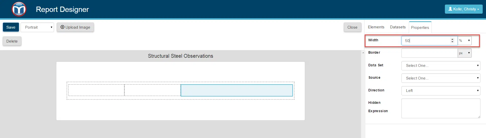 |
| Add fields inside each column. Elements inside Panels are aligned one to another if there is enough space in the same row. | 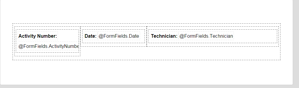 |
Report Designer - Best Practices
Working with Report Elements
As you are building your report, you will be working with various elements. Elements can be split into two categories based off complexity of the content:
- Simple elements are the smallest building blocks. Examples include Labels, Panels, Tables, Images, and Lines
- Composite elements are created by combining Simple elements. For example, when you click and drag a field from a Data Set to your report, you are adding a panel and two labels.
Adding a Form Field / Project Meta Data
There are two ways to add a Form Field or Project Meta Data to your report.
- From the Datasets menu, drag and drop the field to the report
- From the Elements menu, drag and drop a label to the report. Select the label you just added to the report, then from the Properties menu choose the appropriate Data Set and Source.
Use a Panel to Wrap Elements
Simple elements (Labels, Images) which define a logical structure, should be wrapped inside a Panel. For example a Form Field can have a Label, Helper Text, and Value. Those elements should be wrapped inside panel, because together they define a Field.
One of the advantages of this practice is it becomes easier reorder / move the entire panel verses each individual elements

Working with Form Fields
Under the Datasets tab you can find a list of Fields available to add to your report. This list is based on the Active Fields previously added to your Form.
Text Based Fields
To allow for faster addition of Form Fields, several additional elements are preconfigured for you upon dropping a Field onto a form. For example text based field types (Number, Text Area, Multiple Choice, etc.) are dropped onto the report as two Labels (one for the field label and one to display the field value) wrapped inside Panel component. After a Field has been added, all of these components can be altered to fit your needs.
Upon dropping a field onto your report, the Panel has a Hide Expression added automatically to hide itself and the elements inside, if the record being reported contains no value. If you would like this to be hidden using a different set of rules, this may be adjusted from the Properties menu.
File Upload Fields
File Upload field types have the same structure as the text based field types, except that they are using an Image component to display the field’s value. How this Image will be rendered on the generated report depends on the source file type. File Uploads fields allow a wide range of file types to be uploaded while creating an Activity record. However, the report will only support certain types of files.
Image report display by file type:
- Image file types (jpeg, png, bmp, gif) are rendered on the exact position where the image component is placed
- PDF files are attached on the PDF right after the form records. The Image component is replaced with the following text: “See {filename} in the documents section at the end of this report”.
- All other file types are not rendered on the report.
Note that image fields are contained in a Panel wrapper that also has Hide Expression property added by default.
Data Grid Fields
Data Grid fields are also available to drop. When dropped onto your report you will have three options for how the fields will render on your report:
- Vertical Table - Headers span across the page
- Horizontal Table - Headers run along the left side of the page
- Panel - Fields are not placed inside a Table, instead they are added as a simple panel
When adding a Data Grid as a table component (with Data Grid field for the Data Source property) a table title and grid are created by default. All of these elements are wrapped inside Panel component with Hidden Expression that hides all the elements inside if the Data Grid field has no records.
When you are working with Nested Grids, you always must place the nested grid inside the main grid on your report to have the data rendered correctly.
Sections Fields
Section form fields are not available as a data source and cannot be used with any component. Instead, all form fields, nested inside the Section, are available in the Form Fields data set and can be used as normal.
Resources
Resources are uploaded to the report template as static images. These images can be used inside the template.
Hide Expressions
Hide Expression property allows you to hides a component. If the calculation’s result is TRUE, the component won’t display on the generated report. There most common types of expressions allowed for the Hidden Expression property: Is empty and Is last record. An example of how these are constructed is provided below. The system also supports expressions using "Not Equals", "Greater Than", "Greater Than or Equal To", "Less Then" and "Less Than or Equal to". Defining a Hide Expression is done using the Expression Builder interface.
----------------
Is Empty
Is empty is used to check whether a field does NOT contain any value. It has the following format: [DataSet][FormField][FormField] = ‘’
Examples:
- FormFields.ActivityNumber = " "
- FormFields.Discrepancies.Status = " "
----------------
Is Last Record
Is last record expression is used to determine whether the component is used in the last activity record on the template or the last row of a Data Grid field (implemented using Panel or Table). This expression is mainly used with Line components in order to hide the line separator in the last rendered record.
The expression is used like a function:
last()
Calculation Expressions
Calculation Expression is a property that allows you to write expressions directly on a report. This allows for the ability to dynamically report on different data elements within the report itself. The Calculation Expression property is available for standalone fields (Label, Paragraph) or to table fields. When an applicable field is selected Calculation Expression will be listed under the properties tab.

Working with Basic Table Elements
How to Use Build a Table to Display Data Grid Fields
If you choose to build a table rather than dropping the table onto your report, you will need to follow these steps to set up your template.
| 1. From Elements tab, drop Table element on the template. 2. Right click on the table and choose Select Table from the context menu. 3. Open the Properties tab. 5. Choose Form Fields for Data Set. 5. Select the appropriate Data Grid. | 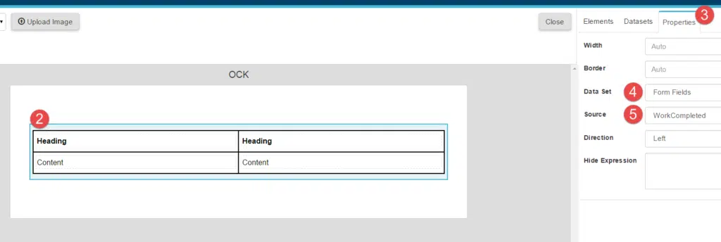 |
How to Add Form Field to a Table with a Data Source (Data Grid Fields Only)
After your table has been configured to source the a data grid, you can work with the columns inside the table. To source data for a column follow the steps below.
| 1. Make sure that the table has Data Source property set. 2. Select the Heading column label you wish to work with. Open the Properties tab and edit the text. 3. Open the Properties tab and select the Form Fields for the data set. 4. Choose a Field in the Data Source dropdown. | 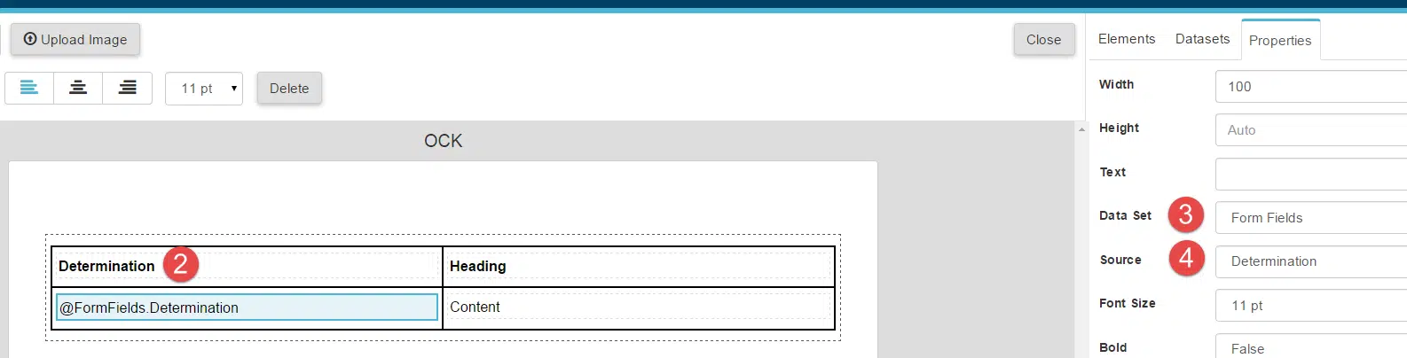 |
How to Add New Column to Table
| 1. Right-click on the existing column from the table. 2. Select "Insert Column Before" or “Insert Column After” from the context menu to add new column. | 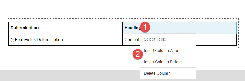 |
How to Use Data Grid Field Inside Table Component
You can add Grid field inside your table only if the field is a child element from the Main Data Gird:
| 1. Drop Panel component inside the table. |  |
| 2. Select the Panel and from the Properties tab select Form Fields as the data set. | 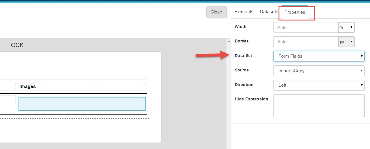 |
| 3. If sourcing a nested data grid, select the appropriate data grid as your source. |  |
| 4. Now inside the Panel element you can add components related to your nested data grid. |  |
How to Control Data Grid Sort Order
| 1. Right-click on a selected cell in the table and click Select Table. | 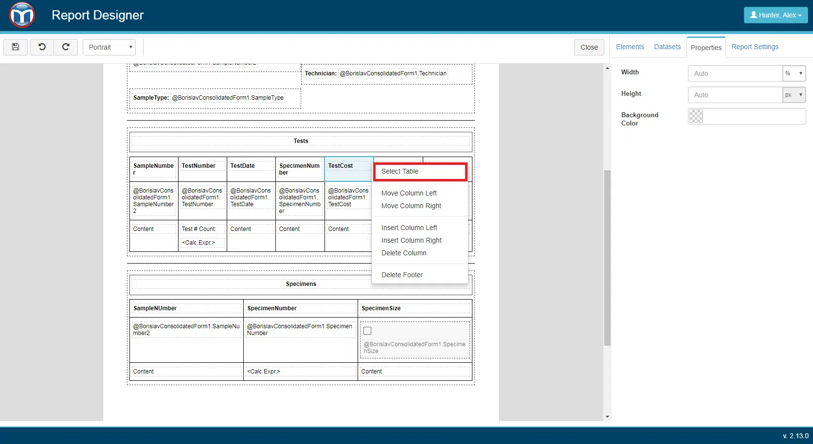 |
| 2. Select the Properties tab. 3. Choose the Data Set and source that you want to use to control sorting. If Data Set and Source don't have a valid value selected, the other fields will not be displayed. 4.Choose your primary sorting data element and if you would like to sort by ascending or descending. 5. (Optional) If you'd like to use a secondary sorting criteria, choose a data element from the Secondary Sort option and choose ascending or descending for the Secondary Sort Direction. |  |
How to Hide Duplicate Records
| When Report Designer has Unique Row = “Yes” setting applied and if there are duplicate data entries for fields present in Multi Record Grid, then for those entries Distinct Record is displayed. | 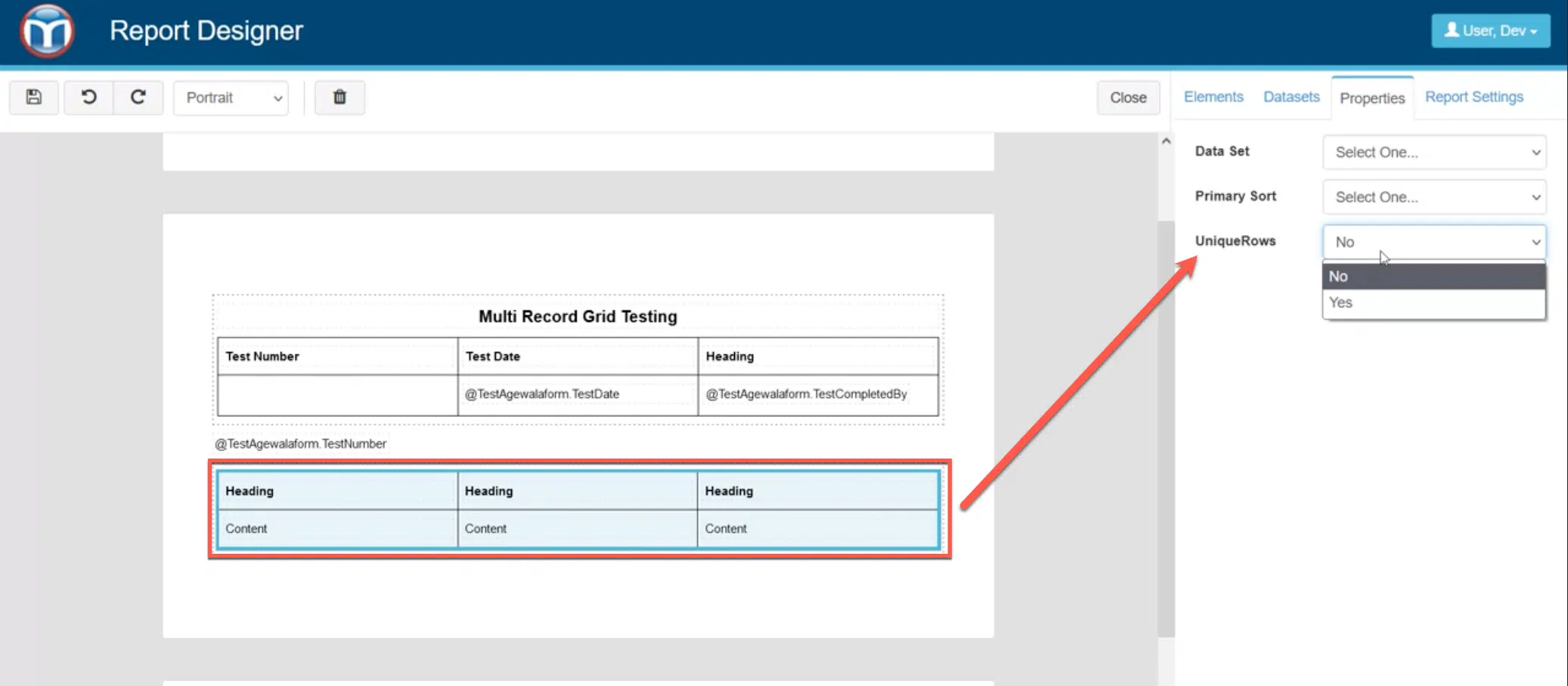 |
Using Main Level, Section and Report Resource Fields Inside a Table
You also can add a table element to your report and apply main level, section fields and report resources inside the table. This is especially helpful if you want a similar look throughout your report. The system does not support the placement of data grids fields AND main level or section fields inside the same table.
Moving and Inserting Table Columns
| Once a table is added to your report, you can quickly move, add or delete a column by selecting the column and right clicking. You will be presented a list of available actions, chose the appropriate option. | 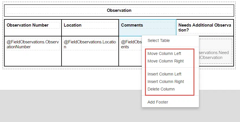 |
Table Footers
| If you need a footer applied to your table, select the table and right-click. An option to add a Table Footer will be presented to you. | 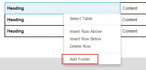 |
| A Label element should be added to the footer cell - and the appropriate data aggregation field should be referenced in the properties of the label. | 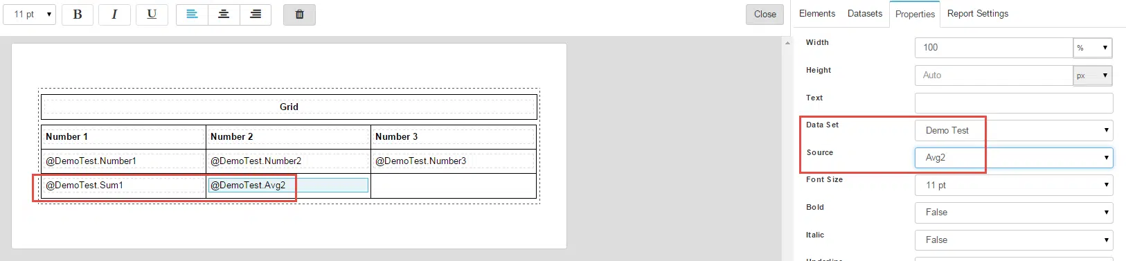 |
Working with Panels
How to Use Panel to Display Data Grid Fields
Data Grid fields can be displayed using with Panel components. Once the source of the panel is set to a Data Grid field, then inside the panel you can place fields related to that Data Grid. Example of a Grid display in a Panel and the Report Output:
 | 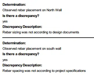 |
Setting the Source of a Data Grid
| 1. Drop Panel element from the Elements menu. 2. Select the Data Grid field in the Data Source property. | 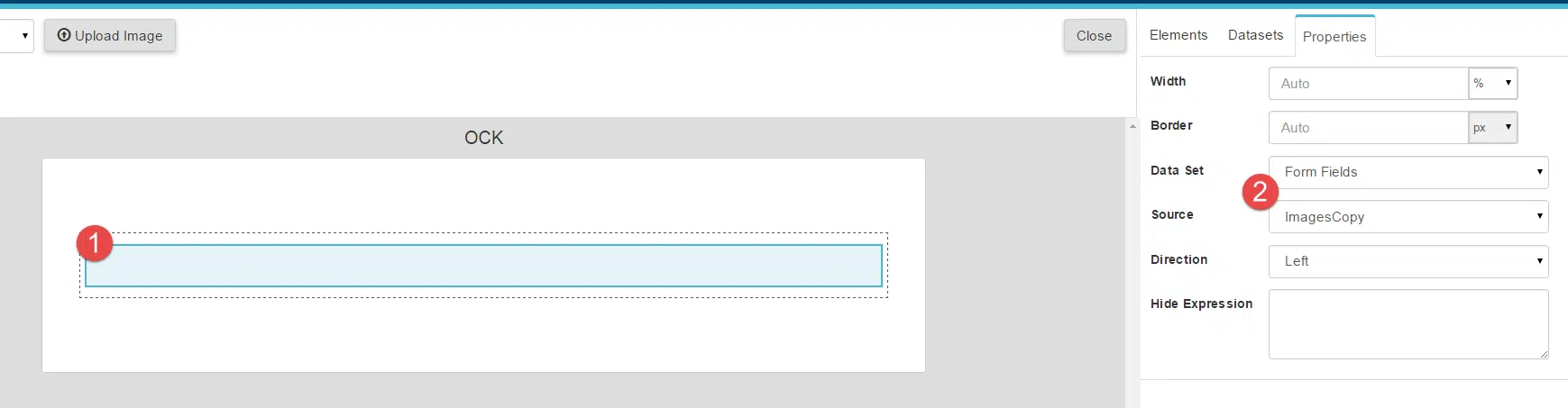 |
How to Add Form Field to Panel with Data Source
| 1. Make sure that the Panel component has Data Source property set. | 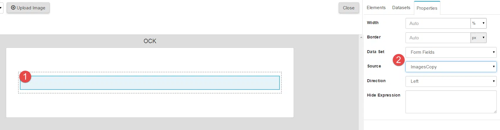 |
| 2. From the Elements tab select Label and drop it inside the Panel. | 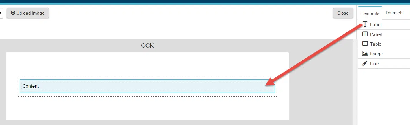 |
| 3. With your label selected, in the Properties panel choose values for the Data Set and Data Source properties. | 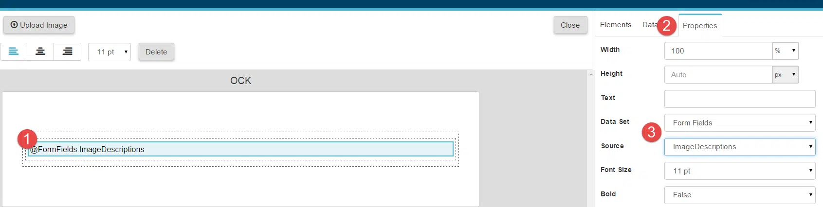 |
How to Add a Line Separator on All but Last Grid row
Line component can be used as separator between each Grid field records.
| 1. Go to the Elements tab and add a line component as the last Element inside the Panel. This line will be rendered after each grid record, including the last record. To suppress the line after the last record, proceed to step 2 and 3. 2. Select the line and open the Properties tab. 3. Type last() inside the Hide Expression property to hide the line in the last row. | 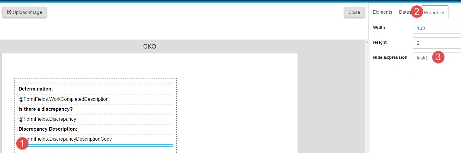 |
Working With Images
How to Fix Stretched Images
To keep the aspect ratio of your images, set a value only for one of the size properties: Width or Height. If the Image component has value for Width, but Height property is left empty, on the generated report it’s height will be calculated to keep the appropriate aspect ratio.
Adding a Resource
Resources are static images that can be used in the report template To add a resource file:
| 1. Click on the Upload Image button on the top bar. 2. Select the image file, that you want to add as resource. | 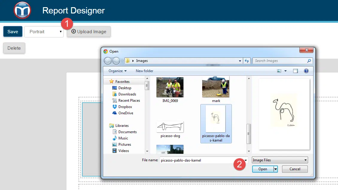 |
| 3. When your image is uploaded successfully it will be available in the Data Sets tab inside Resources data collection. | 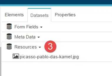 |
How to Add Image Resource on the Template
| 1. Open Data Sets tab. 2. Inside Resources data collection, find the resource you want to add. 3. Drop the resource on the template. | 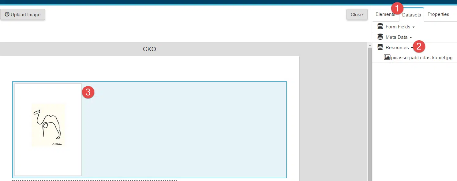 |
How to Change Resources on the Template
Image resources can be used only with Image components. If you have dropped image component and you want to change the resource it uses, follow these steps:
| 1. Select the Image component. 2. Open the Properties tab and make sure the Data Set value is Resources. 3. In the Source, find and select your resource name. |  |
Want to keep learning?
Click here for more how-to articles and MetaField guides. You can also access in-app guidance using the Help Desk!